
Introduction
In a world often characterised by complexity and speed, pastel colours serve as a true sanctuary. Pastel colours have a unique ability to evoke nostalgia and sentimentality, happiness and comfort. Pastel colours are also associated with elegance, sophistication, and a dreamy aesthetic.
Pastel colours communicate to us springtime and brighter days, uplifting our mood and remind us that simplicity and serenity endure. Pastels, or tinted colours as they are sometimes known, comprise a collection of gentle, muted tones formed by blending white with vibrant, saturated hues. Renowned for their subtle and delicate tones, they are often termed "soft colours." Characterised by their low saturation levels, pastels communicate a gentle and dreamy aesthetic, with a nod of sophistication and timelessness.
Where are pastel colors on the colour wheel?
Pastel colours can be found in various regions of the colour wheel, depending on the original saturated colour they are derived from. For instance, pastel shades of red are located in the pink and peach regions of the colour wheel, while pastel blues and greens are in cyan and aqua. Similarly, pastel yellows are found in the lemon and pale yellow regions, and pastel purples in lavender and lilac.

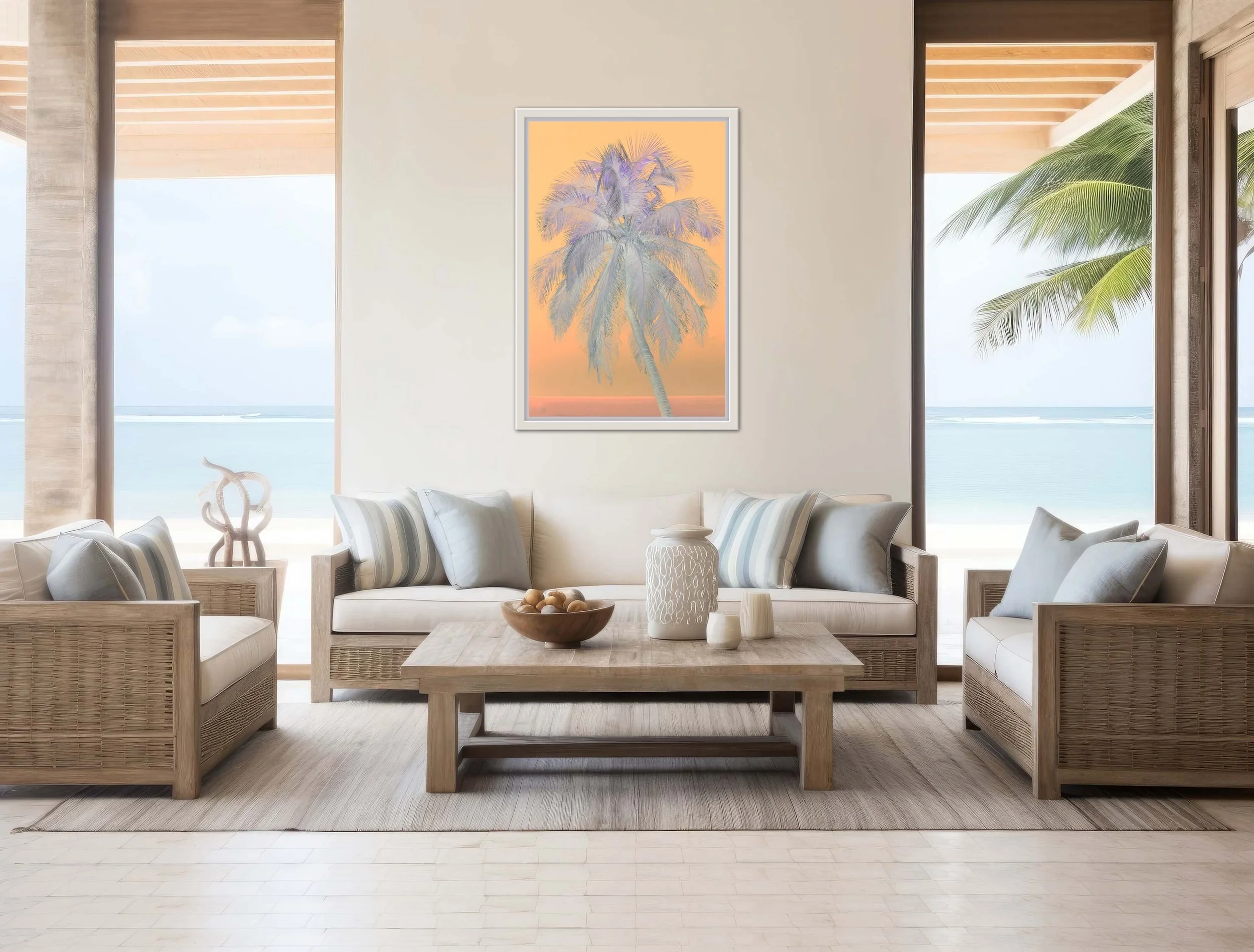
How do you use pastel coloured artworks in your space?
When using pastel coloured artwork in your space, it requires careful consideration of colour harmony, contrast, and balance.
Here are some tips on how to use pastel coloured artworks in your interior designs:
1. Choose the right complementary colours
Pastel colours work great when paired with complementary colours. Together, they can create a combination that’s needed for the right contrast and balance in your design. For instance, a pastel blue can be complemented with a pale yellow, and pastel peach can be paired with lavender. You can see how this works in the artwork below. The colour combinations add a relaxing feel.

2. Play with contrasting colours on walls
Contrasting pastel coloured artwork with bolder, darker hues on the walls can make your designs more visually interesting. For example, pairing a pastel peach with a dark navy blue wall can create a contrast that adds depth and dimension, while contrasting pastel pink artwork with a rich burgundy or deep plum wall can add dynamism, while still maintaining the softness of pastel tones.

3. Use pastel artwork as accents
Pastels can also be used as accent colours to add pops of softness and charm to your interior design. For instance, incorporating pastel-coloured artwork is the perfect way to incorporate these delicate shades into your home or workspace. Pastel-coloured artwork can have a calming effect, creating a serene and peaceful atmosphere within your living or work space. Pastel toned art can visually expand a room, making it feel more spacious and airy.
4. Use pastels in a range of design styles
Moreover, pastel shades possess a versatility that allows them to complement a wide range of decor styles, from minimalist to eclectic. Pastel-coloured artwork can evoke feelings of nostalgia and warmth, creating a sense of comfort and familiarity. Overall, incorporating pastel hues into your wall art not only enhances the visual appeal of your space but also contributes to a welcoming and harmonious environment conducive to relaxation and well-being.
You can also add pastel coloured accessories such as cushions, throws, or rugs, which can also instantly transform a space into a cosy and inviting sanctuary.
5. Use neutral colours as anchors.
When using pastels, it’s best to start with a neutral base. This can be a white or beige wall color, or a neutral-colored sofa or rug. This will allow your pastel accents to stand out and create a balanced look. Incorporating neutral colours such as white, gray, or beige can help balance the softness of pastels. They can act as anchors in your interior design, preventing the pastel colours from overwhelming the overall aesthetic. Try using them when creating a neutral background or incorporating visual accents
Moods

However, pastels are more than just visually appealing, colours have a profound impact on our emotions, moods, and perceptions, and pastel colours are no exception. While bold and vivid shades can evoke enthusiasm and intensity, pastel colours offer a distinct visual experience. Pastel colours have a profound impact on our perception and emotions; these soft hues evoke specific feelings of calmness and relaxation, as well as happiness, optimism and feeling upbeat. Pastel colours have a unique ability to evoke nostalgia and sentimentality. They transport us to simpler times, conjuring childhood memories and the warmth of the past.
Meditation and retreat centres
Pastel coloured artwork can be great to use as accents in retreat centres and meditation sites. They add a mood of calm and serenity,
Bedrooms
Artworks with soothing colours, such as pastels, are perfect for bedrooms. Peaceful landscape photography is a good choice. Create a calm oasis for the evenings and lazy weekend mornings.
Living areas
Why not step out of your interior design comfort zone? If you have a traditional space with original features why not contrast it with a contemporary artwork? In the living room you can go a little wild - mix styles and colours,
Office spaces
When selecting artwork for your office walls, it’s important to consider the overall atmosphere you’d like to create. Brighter, bolder pieces can help enliven a space, and more subtle, calming pieces can help provide a more relaxed environment.
Hotel Rooms
Pastel hues in the artwork of hotel rooms are perfect to create a serene and relaxing atmosphere for guests. Of course the style has to work with the interior design style of the hotel.
Spiritual significance of pastel colours
Pastel shades symbolise tranquility, serenity, and balance,and are often associated with certain spiritual meanings.
For instance, the color pale blue evokes feelings of tranquility and peace, while soft pink embodies love and kindness. Gentle green represents renewal and growth, while muted purple conveys spirituality and mystery. Pale yellow is often linked with optimism and happiness, light lavender signifies grace, spirituality, and elegance, and subtle peach may symbolize warmth and comfort.
These colours are often used in spiritual practices such as meditation or healing, to promote calmness, harmony, and balance.
Let’s look at each pastel tone in more depth:

Pale Blue: Tranquility, Peace
Pale blue holds deep meaning with its tranquil and ethereal feeling. It is a colour that brings up feelings of sanctuary, serenity, peace, and freedom. This colour encourages us to let go of limitations and embrace the freedom to explore our true potential. Often associated with the vastness of the sky and the depths of the ocean, pale blue represents limitless possibilities.
Pale blue is also linked to communication and self-expression. It encourages us to clearly and authentically express our thoughts and emotions.
In spiritual terms, pale blue represents awakening and enlightenment, it encourages us to navigate our life with grace and wisdom.

Soft pink: Love, Kindness
Soft pink is another pastel colour with profound spiritual significance, and embodies a delicate and nurturing energy that extends from the symbolism of pale blue. This calming and nostalgic hue holds a deeper meaning, nodding at feminine aspects and the power of compassion and love. People associate baby pink with childhood innocence and the beauty of life before it becomes more complicated.
Light lavender: Healing
A truly soothing hue, holds a special place in my heart in the realm of pastel colours. This serene shade has the power to evoke a sense of calmness and tranquility, allowing us to find solace and inner peace in our busy lives and peace within our souls. I find lavender very healing personally. Lavender also hints at luxury.
Pale yellow: Optimism
Pale yellow holds a message of optimism. It is a colour that radiates warmth and joy, inviting us to embrace the beauty of life.
Like the first rays of the morning sun, pale yellow symbolises new beginnings and fresh perspectives. New life. This gentle hue whispers of hope and encourages us to have faith in ourselves and the universe. Pale yellow guides us towards growth and self-discovery. It reminds us that we have the power to create our own reality and that freedom lies within our hearts and minds.
Subtle Peach: Warmth, Comfort
In the realm of spirituality, pastel colours serve as silent messengers, each carrying a unique, powerful message. When understood, these hues can inspire profound tranquility, balance, and freedom. Achieving equilibrium within oneself can be achieved by embracing the gentle and harmonious essence of subtle peach. This delicate colour symbolises warmth, compassion, and understanding.
Subtle peach encourages us to find balance in our lives by promoting a sense of calm and tranquility. It reminds us to approach life with softness and gentleness, allowing us to navigate through challenges with grace and poise. Subtle peach invites us to let go of our worries and fears, and instead, focus on creating harmony within ourselves. By embracing this color, we can find a sense of freedom and liberation from the burdens that weigh us down. Subtle peach gently reminds us to honour ourselves and our needs, bringing a sense of lightness and joy to our lives.
Are you ready to create your sanctuary with pastels?
In conclusion, pastel colours possess an extraordinary ability to heal and uplift our spirits. Their gentle hues evoke childhood nostalgia, serenity, happiness, and optimism, infusing any environment with a sense of peace and positivity. Each colour within the pastel spectrum carries its own unique energy, from the calming aura of pale blue to the comforting warmth of subtle peach. Whether it's the soothing essence of lavender or the soft charm of baby pink, pastel palettes offer a myriad of possibilities to uplift and enrich your living or work space into a sanctuary of tranquility and joy.
See my Endless Spring Collection for some beautifully uplifting artworks.